/* ==========================================================================
WorldHop — REUSABLE COMPONENTS
Blocks that appear on more than one page live here, once, so there is a
single copy to change. Loaded AFTER brand.css and after each page's own
stylesheet, so a page can still override a component if it genuinely has
to — but the default is that it doesn't.
This is deliberately NOT brand.css. That file is fonts, palette and base
type only, and it says so at the top; layout components going in there is
how it drifted last time.
Currently in here:
.app-band — the "Beyond the page" app promo, used on /books and /usa
.club-band — the WorldHop Club promo, used on /usa
(.print-trio, a fanned pass-and-pages visual, lived here briefly and was
superseded by the Club hero art. It is one `git show` away if wanted.)
Pages that load this file: /books, /usa
========================================================================== */
/* ==========================================================================
APP BAND — "Beyond the page"
Markup (copy verbatim; the only things that change per page are the copy
and the trailing link):
The .app-band class is a marker for humans — the styling below hangs off
.promo-band.dark, which is what both pages already used. Do not rename the
existing classes without checking both pages.
========================================================================== */
/* App promo headline — set like the advert: all caps, the first clause in
mango, the rest in cream. Same --h2 size as every other section heading, so
the promo band reads as a peer of the sections around it rather than as a
smaller footnote. */
.promo-band.dark .eyebrow{color:var(--mango)}
/* SELF-CONTAINED ON PURPOSE — read this before "tidying" anything below.
The first version of this component read `var(--h2)` for the headline and
let `.eyebrow` come from the page stylesheet. That looked like sharing and
wasn't: /books defines --h2 and restyles .eyebrow into plain uppercase
text, /usa does neither. Same markup, same "shared" CSS, two completely
different-looking bands — a small headline and a pill eyebrow on one, a
huge headline and a plain eyebrow on the other.
So the rule for this file is: a component may use brand tokens (--cream,
--mango, --night, --font-body) because brand.css loads on every page and
is the actual single source of truth. It may NOT use a token or a base
class that only some page stylesheets define. If the component needs a
value, the value lives here. */
/* One heading scale for every band in this file, declared once. Both the app
band and the club band read it, so the two can never drift apart the way
/books and /usa did. */
.app-band,.club-band{
--band-h2:clamp(36px,4.8vw,58px); /* was var(--h2), which only /books had */
}
/* The band's own eyebrow treatment: plain uppercase, not the cream pill the
base .eyebrow gives you. Declared here so it looks the same whichever page
it lands on, and so a page changing its own .eyebrow can't move it. */
.app-band .eyebrow,.club-band .eyebrow{
display:block;
background:none;border:0;border-radius:0;padding:0;
font-family:var(--font-body);font-weight:900;
font-size:16px;line-height:1.2;letter-spacing:.12em;text-transform:uppercase;
margin:0 0 10px;
color:var(--mango);
}
.app-band .eyebrow:before,.club-band .eyebrow:before{content:none}
.app-headline{font-size:var(--band-h2,clamp(36px,4.8vw,58px));line-height:1.02;text-transform:uppercase;color:var(--cream);margin:0;text-wrap:balance}
.app-headline .hl{color:var(--mango)}
/* ==========================================================================
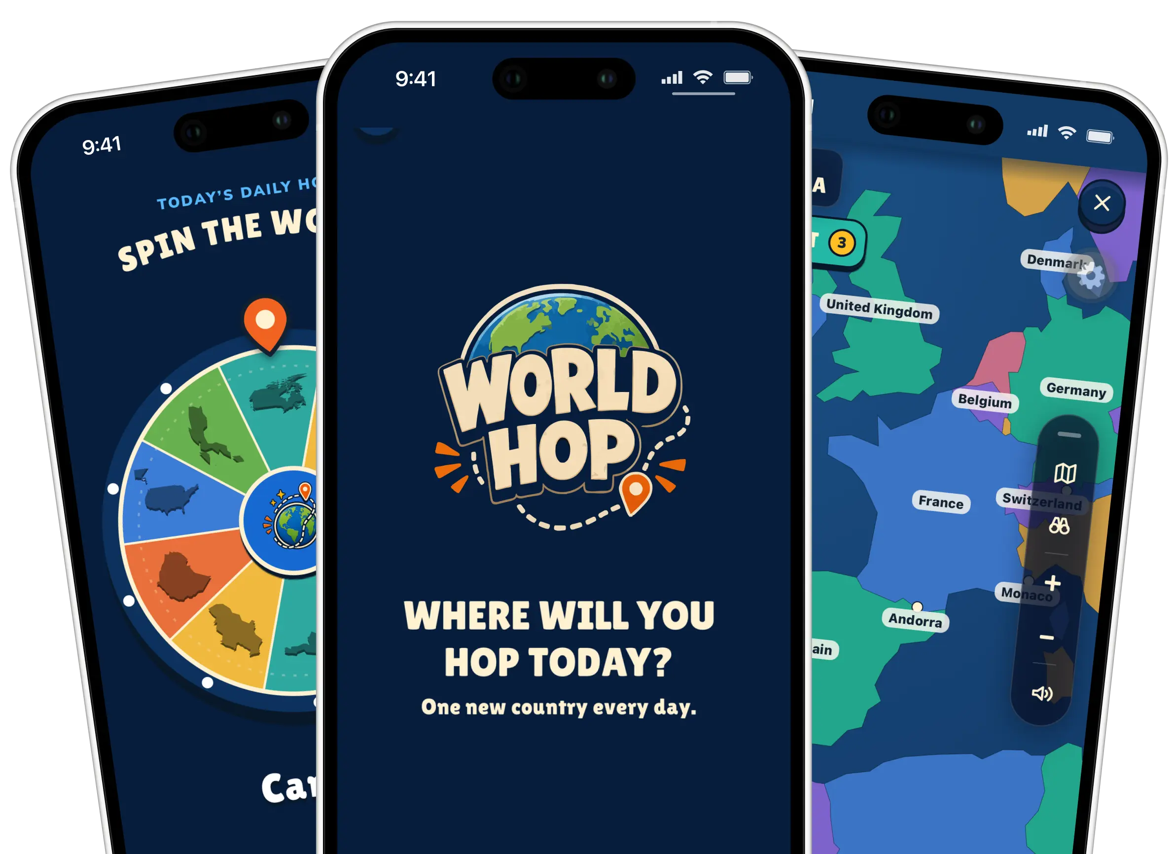
APP SHOT — the three-phone promo image, replacing the old .promo-visual box.
The artwork is a transparent PNG already cropped along the bottom (the
phones run off the lower edge) with their tops intact, so it is built to be
anchored to a bottom edge and grown upward.
HOW THE OVERHANG WORKS, because it is easy to break:
overhang = shot height − band padding − row height
The image is positioned absolutely so it contributes NO height of its own.
The row height is therefore set by the copy column alone, the band stays
short, and whatever height the image has left over spills out of the top.
Give .app-shot a min-height anywhere near --shot-h and the band just grows
to fit, the overhang goes to zero, and it looks like nothing happened.
WHY THE IMAGE IS LEFT-ANCHORED, NOT CENTRED: it is a 1.377 landscape, so
any height great enough to overhang is also wider than half the content
column. Centring would push the leftmost phone under the copy and wreck the
text. Anchoring left sends the whole overspill rightwards instead, into the
page margin and away from anything that has to stay readable. html/body
already carry overflow-x:clip, so nothing can cause a sideways scrollbar.
========================================================================== */
.promo-band.dark{overflow:visible;position:relative}
/* The image column takes the larger share — three phones need more width than
a paragraph does. */
.promo-band.dark .promo{align-items:end;grid-template-columns:1fr 1.12fr;gap:40px}
/* Copy stays above the artwork in the stacking order no matter what. */
.promo-band.dark .promo > div:first-child{position:relative;z-index:2}
.app-shot{
--band-pad:64px; /* must match .promo-band's padding */
--shot-h:clamp(470px,37vw,560px); /* THE KNOB: raise this for more overhang */
position:relative;
min-height:200px; /* a floor only — deliberately far below --shot-h */
}
/* NOTE THE [width][height] IN THIS SELECTOR — it is load-bearing.
The stylesheet carries a blanket `img[width][height]{height:auto}` rule
(see the top of this file, inherited from /usa). That is specificity
(0,2,1); a plain `.app-shot img` is only (0,1,1), so the blanket rule wins,
the height here is discarded, width:auto then has nothing constraining it,
and the image renders at its intrinsic 2385px. Matching the attributes
here takes this to (0,3,1) and it behaves. Any future rule that sets an
explicit height on an image with width/height attributes needs the same
treatment. */
.app-shot img[width][height]{
position:absolute;
left:0;
bottom:calc(-1 * var(--band-pad)); /* flush with the band's true bottom edge */
height:var(--shot-h);
width:auto;
max-width:none;
filter:drop-shadow(0 24px 34px rgba(0,0,0,.5));
}
/* Below 1100px the two columns get too tight for a shot tall enough to
overhang, so the band stacks instead — earlier than the 980px the other
promo bands use. Stacked, the copy sits directly above the artwork, and an
upward overhang would ride straight over the CTA buttons; so here the image
returns to normal flow (no overlap possible) and keeps only the
bottom-flush half of the effect, via a negative margin cancelling the
band's bottom padding. The bust-out is a wide-viewport flourish. */
@media (max-width:1100px){
.promo-band.dark .promo{grid-template-columns:1fr;text-align:center;gap:26px}
.app-shot{position:static;min-height:0;margin:24px auto -64px;display:flex;justify-content:center}
.app-shot img[width][height]{position:static;height:auto;width:min(460px,94%);max-width:100%}
}
@media (max-width:700px){
.app-shot img[width][height]{width:min(380px,96%);filter:drop-shadow(0 16px 24px rgba(0,0,0,.5))}
}
/* ==========================================================================
BASE RULES THE BANDS DEPEND ON
This file used to describe itself as the shared component sheet while
silently relying on book-page.css for .promo, .promo-band and .appstore.
That worked only on pages that happened to load book-page.css, which is why
the app band could not simply be dropped onto the homepage or /club.
The values below are copied verbatim from book-page.css. On a book page
this sheet loads after book-page.css, so these re-declare identical values
and change nothing; on the homepage and /club they are the only definition.
If you change one, change both, or better: delete the book-page.css copy.
========================================================================== */
.promo{display:grid;grid-template-columns:1fr 1fr;gap:48px;align-items:center}
.promo-band{padding:64px 0}
.promo-band + .promo-band{border-top:1px solid var(--line)}
.promo-band.dark{background:var(--night);color:var(--cream)}
.promo-band.dark .sub{color:rgba(255,241,210,.78)}
/* No .cta-row rule here either. The band's row always carries .store-row too,
and .store-row (below) sets its own gap and margin-top. An .app-band .cta-row
rule outranks it and quietly reverted both, adding 6px to the band on /usa. */
/* Deliberately NO font-size on .sub here. book-page.css scopes its .sub rule
to `.section .sub`, and the band is a .promo-band, so the paragraph inside it
has always inherited the page's body size. Setting one grew the band 39px on
/usa when this block was first written. */
.appstore{display:flex;align-items:center;gap:10px;background:var(--night-deep);border:2px solid rgba(244,233,211,.35);border-radius:14px;padding:10px 18px;box-shadow:0 7px 0 #02070e,0 13px 22px rgba(0,0,0,.25);transition:transform .15s ease;text-decoration:none;color:var(--cream);cursor:pointer}
.appstore:hover{transform:translateY(-2px)}
.appstore svg{width:26px;height:26px;flex:0 0 auto}
.appstore .apple{fill:currentColor}
.appstore .gplay{width:24px;height:26px;flex:none}
.appstore .t{display:flex;flex-direction:column;line-height:1.15}
.appstore .t small,.appstore .t strong{white-space:nowrap}
.appstore .t small{font-size:10px;opacity:.75;font-weight:700}
.appstore .t strong{font-family:"Lilita One",cursive;font-size:16px;font-weight:400;text-transform:none}
@media (max-width:1100px){ .promo{grid-template-columns:1fr;text-align:center} }
@media (prefers-reduced-motion:reduce){ .appstore{transition:none} .appstore:hover{transform:none} }
/* Store badges in the app band — same .appstore component as the homepage and
/usa (its styles are already in this sheet, inherited with the framework).
The row just needs to wrap on narrow viewports and sit centred when the
band stacks. */
.store-row{display:flex;flex-wrap:wrap;gap:14px;margin-top:24px}
.store-note{margin:16px 0 0}
.store-note a{color:var(--mango);font-weight:800;font-size:15px;text-decoration:underline;text-underline-offset:4px}
.store-note a:hover{color:var(--cream)}
@media (max-width:1100px){
.store-row{justify-content:center}
/* ==========================================================================
CLUB BAND — the WorldHop Club promo
Sibling of .app-band and deliberately built the same way: it declares its
own heading size (via the shared --band-h2 above) and its own eyebrow, so
it looks the same on every page it lands on rather than inheriting
whatever that page happens to do with .eyebrow.
The one thing it can't share with .app-band is the eyebrow colour. The app
band sits on navy, where mango reads; this one sits on cream, where mango
fails contrast. It uses --orange-d for the same reason the /books cream
sections do.
Markup:
========================================================================== */
.club-band .eyebrow{color:var(--orange-d)}
.club-headline{font-size:var(--band-h2,clamp(36px,4.8vw,58px));line-height:1.02;text-transform:uppercase;margin:0;text-wrap:balance}
/* The hero art is a square transparent PNG of the explorer pass, so it wants
room to breathe rather than the tight padding the old text-label box used.
[width][height] again — the blanket img rule would otherwise win. */
.club-art{padding:26px;min-height:320px}
.club-art img[width][height]{
display:block;
width:min(88%,420px);
height:auto;
filter:drop-shadow(0 18px 26px rgba(8,29,57,.35));
}
@media (max-width:980px){
.club-art{min-height:260px;padding:20px}
.club-art img[width][height]{width:min(76%,320px)}
}